
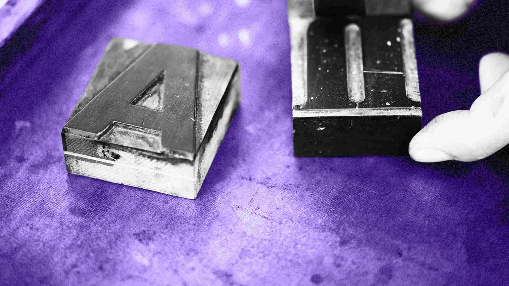

As a typographer, I spend my days obsessing over fonts—how they look, how they function as software, and how they affect readers. As a business leader, you may find that odd, but I assure you: You should be obsessing over fonts, too, because in today’s media landscape, how we say what we say is crucial to connecting with our audiences.
Fonts are your brand’s visual voice, and if its voice doesn’t cut through the chatter, it’s probably just contributing to it.
BECOMING TYPOGRAPHY LITERATE
My ancestors were illiterate. If you go back around three hundred years, you’ll probably find that yours were, too. My great-great-grandfather was a farmer, as was his father, and his son. And they didn’t spend a lot of time reading books—or anything else. Widespread literacy is a new thing. While written language is thousands of years old, language recorded via typography is just 650 years old.
Books existed when the Nixes were plowing furrows in early America, but not in a meaningful way for working people. As a species, we’re all still coming to grips with reading as a lens on the world. We’re all new to it. It took until the beginning of the 20th century (more than 500 years from the invention of movable type) for printed materials such as books, newspapers, and magazines to make it into the hands of “common people” like my grandfather.
THE RISE OF THE BOOK
What changed? Everything. Electricity made evenings brighter and more productive. Trains and cars made populations more mobile. Factories drew folks like my grandfather out of rural farm life and into the bustling city. Public schools exposed new generations to books and reading. And the Monotype machine and the Linotype machine were invented.
Up until the very end of the 19th century, type was set pretty much like it had been since Gutenberg’s time: one character at a time, by hand. The Linotype and Monotype mechanized the setting of type, making print production faster and cheaper.
Gutenberg’s movable type changed the course of history, but mechanized typesetting shaped culture. It spawned new industries, supercharged commerce, and sped the dissemination of information. Book publishing skyrocketed.
BEYOND THE BOOK
Global literacy jumped from a mere 20% in 1900 to nearly 90% by 2000, with the steepest climb happening after World War II. Despite a media landscape that included radio, motion pictures, telephones, and television, print dominated. Books, magazines, and newspapers were the staples in our media diet.
And then the web happened. And then social media happened. TV and movies, always there in the background, were suddenly available digitally, on demand. The attention we lavished on print was scattered by the digital prism.
We all still read a lot—but just not as many books. We read other stuff—short stuff—and lots of it. I could tease you about what you’re reading, but I’d be teasing myself, too. It might be click-bait and captions, but it’s still reading.
FOLLOW THE MONEY
Money moves where the action is, and the economy of print is not what it was. We will probably never see the vitality and scale of 20th-century book publishing (or magazine publishing) again. Movies and television will never be quite what they were either. The competition of mediums and methods is a competition for attention and money.
The attention (and the money and the mediums and methods) end up shaping our messages—changing the way we communicate. What we say and read in social media is far different from what we say and read via narrative fiction and non-fiction.
Typography is the shape of language.It attracts attention, and we’re all acutely aware of the attention economy. Great typography, as I mentioned at the top, cuts through the chatter.
WHAT ARE YOUR CLOTHES SAYING ABOUT YOU?
All clothing is fashion—high and low. It’s semiotic; it sends a signal. A T-shirt and jeans are as clear a signifier as a Chanel dress. Typography—clothing for words—is also a signifier of meaning: a differentiator, a messenger.
Typography is the clothing your words wear every day, all day, even when you’re sleeping. It’s functional, yes, but it has the potential to be a clear statement of your ideas, your motivations, and your values.
BECOME TYPOGRAPHICALLY LITERATE
Here are three steps you can take to start your typographic journey right now:
1. Read About Type
Reading about type can quickly get you thinking like a typologist, and is a great way to familiarize yourself with various font strategies and styles. These three great books will gently introduce you to the subject:
- Thinking with Type by Ellen Lupton
- Why Fonts Matter by Sarah Hyndman
- Just My Type: A Book About Fonts by Simon Garfield
2. Take A Typography Course
A typography course—Canva and LinkedIn both offer great ones—is easy to do from the comfort of your own home.
3. Talk To A Typographer
Chances are good that someone at your company (a designer, creative director, or art director) has a penchant for typography. Reach out and start a dialogue. Individual insights are invaluable.
The right font has the potential to change the trajectory of your brand. Harness that potential. Become typographically literate.