

The words “I see you” written in a soft, friendly font like Word’s Segoe Script convey a personal, empathetic knowledge of the recipient.
But in a frightening font like Chiller by Andrew Smith and ITC, it’s a threat.
Friendly, frightening, fun, powerful, trustworthy, intelligent, inclusive—these are just a handful of the ideas and emotions Monotype helps its clients navigate. Monotype, in addition to offering one of the largest font libraries in the world, also designs bespoke typefaces.
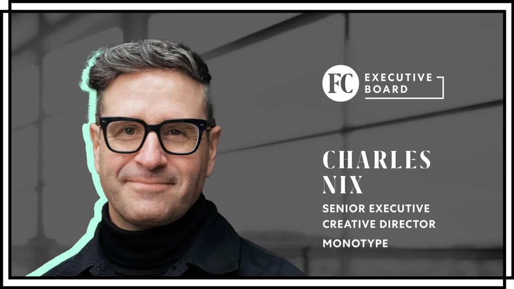
“We exist because the way language looks has an effect on its meaning,” says Charles Nix, Senior Executive Creative Director. “Our mission is to make typography more vibrant, bold and communicative.”
The son of a printer, Nix says that before computers, only those directly involved in the printing industry really knew much about typefaces. “But now my mom has a favorite typeface. All of our moms do, whether they know it or not.”
TYPEFACES ARE A LANGUAGE EVERYONE SPEAKS
Brands, like people, are unique. They come to Monotype to find and develop typefaces that broadcast who they are to the world. Brands lean heavily on social proof, experience, awards and hype to differentiate themselves from one another. But there is something else, a je ne sais quoi, that makes a brand distinct among its peers. Typeface is an integral part of that.
Typography is a language everyone knows but few understand, much like how we all enjoy music, but most can’t read notes on a page. “Everyone is a functional typographer now,” says Nix. “We all use type, and we’re surrounded and influenced by type every day.” People today know the difference between Helvetica’s stern bravado and Comic Sans’ silly smirk. Even if they don’t know the names of the fonts, users instinctively infer certain traits onto the message and the brand it originated from.
Typography even binds us together into groups. Those of us who get the Comic Sans jokes and have seen the Helvetica movie belong to a world of typographical nerdiness. And for all of us, even those who don’t think of themselves as type enthusiasts, typefaces identify the genre of books we read, the music we download and the labels of the products we buy. The typography of our choices creates a strong part of our cultural identity.
PAST, PRESENT AND FUTURE—THE EVOLUTION OF TYPE
Monotype’s roots date back to 1887, when its namesake was founded as the Lanston Monotype Machine Company in Philadelphia. A type foundry and maker of machines for setting type, the Lanston Monotype Machine Company’s original Monotype machine solved a very functional need to communicate more and more quickly. Today’s Monotype Imaging Inc., founded in 1999, solves the same problem with design and font software.
Where in the past, fonts were licensed to designers on a perpetual basis, now, the business model is evolving similarly to the music industry. We went from owning analog recordings of music on records, tapes and CDs, to digital MP3s, to subscribing to music streaming services. We have more music at our fingertips today than ever before.
The same is happening with type. Monotype is changing the business model for the font industry. Instead of buying individual fonts or font families for a one-time fee, designers can now access thousands of fonts through subscription plans.
Monotype offers more than 150,000 fonts from foundries across the world through its font subscription platform, Monotype Fonts. However, having access to all these fonts can create choice paralysis. When brands approach Monotype looking for their typographic voice, Monotype employees act like docents, guiding customers through the font library and translating ideas into typographic form.
If a customer finds a font but wants to create a more unique fit for their brand, the Monotype Studio can tailor it into something new. Tiny modifications, like changing the shapes of a handful of letters, or larger changes like adding Greek language support, can transform an existing typeface into something wholly new that visually matches the brand’s personality or answers a pressing functional need.
“My job is to be a sort of type whisperer—listening to the ideas and needs of brands, figuring out what makes them unique,” Nix says. “Then we find or create their corollary in typographic form.”
BETTER TYPOGRAPHY FOR A BETTER VISUAL FUTURE
We see more typography in the first 20 minutes of our days than our ancestors saw in their lifetimes. It’s the 21st century, and everyone is a functional typographer. We communicate via type many times a day in our email, documents and messages. We set more type than any generation ever before. We use type. We feel type. But few of us understand and effectively control the effect that typefaces have on communication. Nix seeks to change that.
“My mission is to further the 21st-century trend toward greater typographic literacy. Our typography is our visual voice. I want to empower people to choose that voice well—to be knowledgeable and confident in this imperative aspect of how we communicate,” Nix says.
“To be here at Monotype at this moment in the arc of typographic history is a privilege and responsibility,” Nix says. “We’re living through an amazing typographic renaissance—an explosion of typographic form and technology. I’m grateful to be here, acting as a shepherd to the past and helping design the future.”